Long time ago: 'Die besten JavaScripts - SizeIt!'
Wuhooo, look what I found in my archives:
In my early webdeveloper days I created a small javascript which named ‘SizeIt!’. It purpose was to resize all website elements according to the size of users viewpoint. So regardless which screen resolution the user has, the website propotions would always be the same. Honestly, it worked only in very special cases and was slooooow (these days) :)
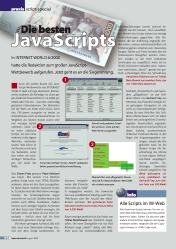
But the idea was great and it even gave me second place in a competition - ‘Die besten JavaScripts’ of Internet-World in August 2000. Read the result here (german only, sorry).
Not sure where I do have source code, will continue searching archive and post it here someday - stay tuned …